Design web responsive
Design mobile-first sur tous les appareils
Assurez un affichage parfait de votre site sur tous les appareils. Grâce à un design mobile-first rapide et moderne, votre site s’adapte parfaitement aux ordinateurs, tablettes et smartphones.
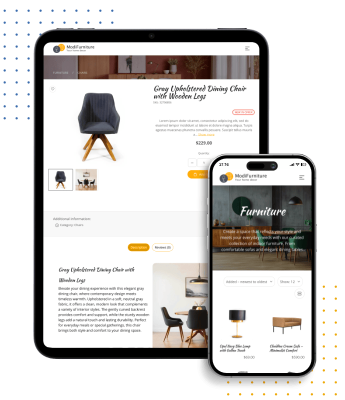
Design web responsive pour tous les appareils
Chaque site est conçu avec un design responsive au cœur, garantissant une expérience fluide sur ordinateurs, laptops, tablettes et smartphones. Votre site s’adapte automatiquement aux différentes tailles d’écran, offrant performance rapide, mises en page claires et expérience utilisateur cohérente partout.
- Mises en page mobile-first optimisées pour smartphones
- Design épuré et évolutif pour grands écrans
- Mises en page adaptatives pour tous les appareils
- Expérience rapide et fluide sur tous les écrans
Modules qui s’Adaptent à Tous les Écrans
Tous les modules et extensions supplémentaires de votre site - formulaires de contact, galeries produits ou sections blog - sont par défaut entièrement responsives. Chacun est conçu pour garantir une parfaite fonctionnalité et une esthétique soignée sur mobile, tablette et ordinateur.
- Mise en page adaptée automatiquement à toute taille d’écran
- Interfaces tactiles pensées pour les utilisateurs mobiles
- Style et comportement uniformes sur tous les appareils
- Compatibilité avec les standards web d’accessibilité

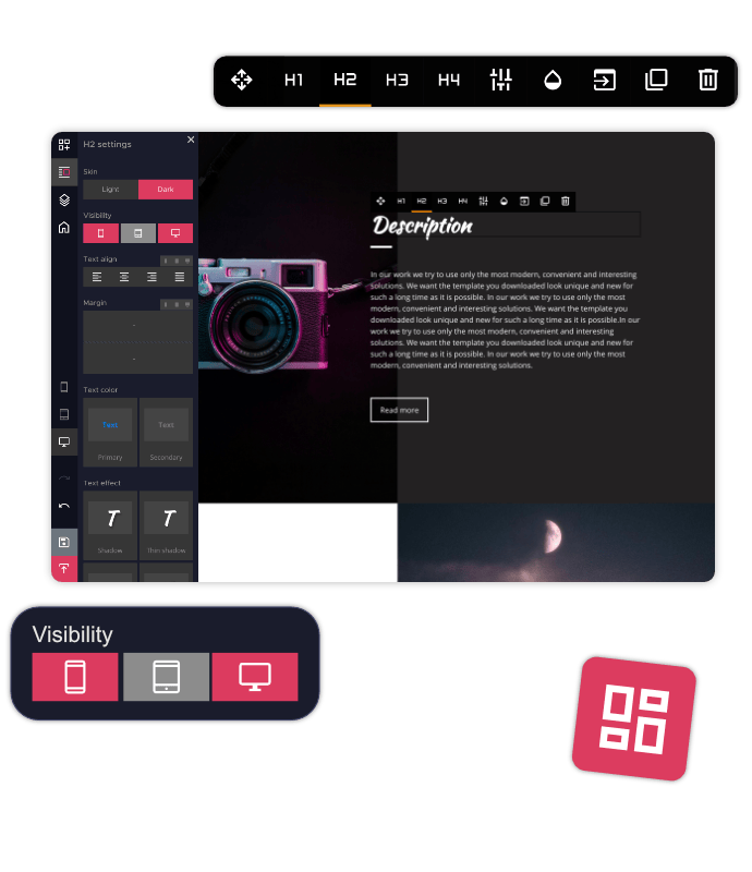
Prévisualisez et Ajustez Votre Site sur Tous les Appareils
Avec le constructeur HitMe, basculez instantanément entre les vues bureau, tablette et mobile. Cet outil d’aperçu en temps réel vous aide à détecter les problèmes de mise en page et à corriger immédiatement, garantissant un rendu parfait sur chaque écran.
- Passez instantanément d’une vue bureau, tablette ou mobile
- Prévisualisez vos modifications sans quitter l’éditeur
- Identifiez et corrigez rapidement les problèmes de mise en page
- Rendu fidèle simulant l’affichage réel des appareils
Définissez le Contenu Affiché selon l’Appareil
Adaptez le contenu de votre site en fonction des écrans. Affichez ou masquez certaines sections selon le type d’appareil pour créer des mises en page ciblées, claires et efficaces, améliorant l’expérience utilisateur et l’engagement.
- Affichez ou masquez des blocs de contenu par appareil
- Créez des expériences adaptées à chaque type d’écran
- Réduisez l’encombrement en supprimant le contenu superflu
- Augmentez l’engagement grâce à des mises en page ciblées

Chargement Rapide, Expérience Fluide
Notre constructeur génère un code propre et optimisé, associé à des techniques de chargement intelligentes, pour garantir un site rapide et fluide. Le design responsive va de pair avec la vitesse et l’ergonomie, améliorant le référencement SEO et la satisfaction des visiteurs tout en réduisant le taux de rebond.
- Code léger et optimisé pour des chargements rapides
- Chargement différé (lazy loading) des images et ressources
- Mise en cache optimisée pour les visites récurrentes
- Améliore le SEO grâce à vitesse et réactivité
Modèles de sites web responsive
Choisissez parmi des modèles modernes et professionnels, conçus avec des mises en page entièrement responsives. Chaque modèle s’adapte automatiquement aux ordinateurs, tablettes et mobiles, garantissant un site propre, rapide et cohérent sur toutes les tailles d’écran.


Questions fréquemment posées
Qu’est-ce que le design web responsive ?
Le design web responsive garantit que votre site s’adapte automatiquement aux différentes tailles d’écran et aux différents appareils. Que vos visiteurs utilisent un ordinateur, une tablette ou un smartphone, votre site s’affichera correctement avec une expérience utilisateur fluide et cohérente.
Mon site fonctionnera-t-il correctement sur les appareils mobiles ?
Oui. Chaque site créé avec notre outil respecte les principes du mobile-first afin de garantir un fonctionnement optimal sur les smartphones et les tablettes. Les mises en page, images, boutons et contenus s’adaptent automatiquement aux écrans plus petits.
Puis-je prévisualiser mon site sur différents appareils pendant la modification ?
Oui. Le créateur de site inclut des aperçus en temps réel permettant de passer entre les vues ordinateur, tablette et mobile. Vous pouvez voir l’apparence de votre site et effectuer des ajustements avant sa publication.
Puis-je contrôler ce qui apparaît sur mobile ou ordinateur ?
Oui. Vous pouvez choisir quelles sections et quels blocs de contenu apparaissent sur certains appareils. Cela vous permet de créer des mises en page plus propres et d’offrir une meilleure expérience aux visiteurs sur différents écrans.
Le design responsive améliore-t-il la vitesse et le SEO du site ?
Oui. Les sites responsive sont optimisés pour les performances grâce à un code propre, un chargement efficace et des mises en page adaptées aux mobiles. Un site plus rapide et mieux optimisé améliore l’expérience utilisateur et peut favoriser une meilleure visibilité dans les moteurs de recherche.
Les modèles et modules du site sont-ils responsive ?
Oui. Tous les modèles et modules disponibles sont conçus pour fonctionner sur les ordinateurs, tablettes et smartphones. Des fonctionnalités comme le e-commerce, les formulaires de contact, les galeries et les sections de blog conservent leur apparence et leurs fonctionnalités sur tous les appareils.